Wednesday, 28 April 2010
Contents Page (Final)
The final contents page came out rather successful after the adjustments were made, it began to display all the elements included in a real magazine. The main change that was made was to add little teasers underneath the headings of the contents page, this was to allow readers to understand what the content would be about for example, 'SPOTLIGHT' would be hard for the reader (especially a first time reader) to know what it may be about.
I chose capitals throughout the heading to make it stand out, seem bold loud and eye catching, it could then make the reader feel as though they have very many options to choose from and read that suit them.
Within the teasers are many rhetorical questions, this helps the reader to think, engage and communicate with the editor of the magazine, perhaps make the reader feel that they are being spoken directly to or that the editor has an understanding of them personally.
In the future, the magazine could be improved by choosing a different picture of the group that may not seem as intimidating as the one currently up, this would then allow the reader to have an insight into the group's personality and how the interview may be.
Contents Page (Rough Draft)
The contents page I was able to construct was a combination of all the elements I had learnt as well as the research I had put together to appeal to my target audience.
Again, I used a space/Enter Galactic to carry on the theme of Next Ting (as well as using the logo in the corner of the magazine like many other magazine tend to do), and creativity using splats/sprays. Photoshop CS4 was a key ingredient into making the contents page as I had to thoroughly manipulate the graphics because most of them were originally black.
The large picture of Forever Christ immediately draws the readers attention to it, making them eager to read and look for the page number.
The two free posters at the bottom of the page are included further into the magazine, this was a way of giving the reader something they could could use as memorabilia/collectors item and also because I did not include and free 'giveaways' or competition entries. The caption underneath the thumbnails of the posters can help give the reader a glimpse of the editors tone as I decided to go for a cheeky approach to the reader which could build a personal connection with the reader.
Finally, the Bible scripture at the top of the contents page was placed there as a form of iconography to bring the Christianity into it, and also as a from of encouragement to those who read it. (Each issue will have a different Bible verse).
Analysing Conventions (Contents Pages)
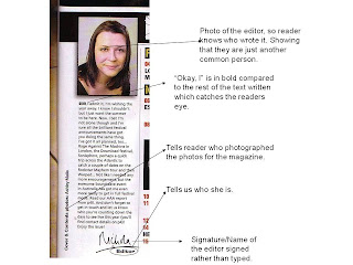
These are the contents pages from various magazine that we were able to analyse whilst taking note as to what should be included when constructing our contents page. It was very helpful as I didn't not know that there where so many points to consider and by doing this excises, I was learning as well as understanding how to layout a contents page, what to include and how I would be able to use it to my advantage and reach my target audience.
Interview Page (Final)
Interview Page (Rough Draft)
This was the first draft of my interview. Firstly the background selected was more of an 'Enter Galactic' feel, this was to make a link between the title of the magazine being Next Ting again showing that it is something different almost out if this would hence using something to do with 'space'. Then from previous pictures taken of Forever Christ, I was able to use the pen tool on Photoshop CS4 and cut around various pictures and combine it onto one page. The body language of the group is very relaxed and had been purposely directed into the positions that they are in so it is almost as if they are pointing at the interview to make to the reader feel that they are being communicated with (i.e the group are saying to the reader 'yes this is me, this is what i have to say about in the magazine, follow where I am pointing at and read the interview').
I continued to keep the theme of the magazine running through it by keeping the 'Next Ting Gospel' in the corner of the magazine. Then a bright green colour was selected for the word Exclusive, this was to make it stand out as well as having the splat/spray behind it to keep the youthful theme too.
Iconography is included again (white cross) to ensure the readers are connecting emotionally and sharing the same belief of Christianity.
Finally, the questions and answers differ in colour as I believed it was a way for the reader to keep engaged using bright colours resembling a rainbow which is something that is naturally beautiful/ intriguing, so I wanted the interview to have the same effect.
Planning My Interview
The questions I asked them were the following:
Front Cover (Finished)
This was the front cover I constructed after making amendments. The previous front cover proved difficult to read as the colour of the fonts clashed with the lighting of the background of the photograph. In order to prevent this from happening in the future, I used the shadow tool with Photoshop CS4 behind the text also to create a 3D effect making the text stand out so it is more visible to the eye of the reader.
The language chosen for the magazine was specifically aimed at my target audience enabling them to understand the contents within the magazine. It is of an informal nature which makes the reader feel they are able to relate to the magazine on a more personal level. For example : '??WHATZ POPPIN' Is common phrase used within the younger generations vocabulary as a way of greeting each other. By having this it is almost as if the editor of the magazine is greeting the reader making them feel welcomed to read it as well as allowing the reader to have a feel of the editors tone and what the content may include.
I then shortened the teasers given under the headings, this was due to the fact that i had given away too much information and not allowed the reader to feel more eager to know what is inside the magazine. When the change had been made I feel it was successful as the teasers are short and sharp which can relate to regular readers or first time readers.
Finally, a price tag (which is priced at £2.75 as it is a monthly magazine making it affordable for my target audience) and date was placed on the magazine to make it look more like a professional magazine. The date could as well be an indication of then the reader purchased the magazine as it could later on become a collectors item and would be able to keep track of all magazine collected.
Thursday, 15 April 2010
Final Front Cover (Rough Draft)
Sunday, 11 April 2010
Potential Front Covers
This was the first cover I wanted to used for my magazine.
It is incomplete as I realised during the making of this that it fails to attract my target audience, does not look like a conventional magazine and is not eye-catching.
However I wanted to continue to use the record element as it represents music and is an obvious symbol. I then wanted to have other aspects of my magazine i.e. the Bible, clothes, shoes and accessories bursting out of record (just as the graphic design) to show to the reader that as well as music being the most focused upon, there will be other sources of entertainment in the magazine to keep the reader occupied.
One of the main aspects of the magazine was the interview with Forever Christ, so then I decided to crop out one of the images I took of a member of the group and use it on the front cover which allows the reader to have an insight to what the members look like if that have not already seen them before. I also chose to use this particular picture because his body language is very comfortable/ approachable and he happens to be pointing in the same direction as the masthead. By having that it could almost create the illusion that he is a aware of the fact that he is on the front cover of the magazine and appreciates it. (It is very common for a person to point at something/someone whilst taking a picture as is shows respect and appreciation).
Lastly, I managed to continue to use the splat/spray feature on the front of the magazine underneath the record which is a theme that I think worked successfully.
Here is another attempt of a front cover.
I very much liked the record idea so I chose to use it again this time without having any decoration in the background, this was so that it would not clash with the picture of all the members of Forever Christ.
I didn’t think this would be a successful magazine front cover due to the fact that having three males along with blue font makes the magazine seem very masculine. By having this it limits my target market as well as making it ender bias. So I chose not to use this either but develop the idea of splats/sprays.
Trying Out A Masthead
After being inspired by such magazines as RWD as well as using elements from other Gospel magazines, this was a masthead I managed to create as a sample.
I very much liked the 3D effect and wanted it to be carried throughout the magazine but realised that the colours used were not appealing (even though blue and pink represent male and female), I did not like the shades either. The colours are too pale and would make it very difficult to find graphics/pictures etc that would compliment this.
Wednesday, 7 April 2010
Researching Mastheads
Saturday, 3 April 2010
Choosing A Name
Wednesday, 31 March 2010
Final Picture Chosen
Elements I Wanted To Include In My Front Cover
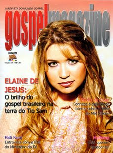
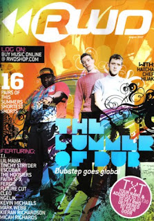
I then went on to look at other magazines that were not Gospel (in this case RWD a successful magazine in the UK- where my magazine will be distributed also), but either targeted a similar audience to mine or had the type of presentation/aspects that would like to use as my front cover. Many of these front covers consisted of bright colours, plenty of graphics and effects, large masthead, and could have more than one person/ celebrity on the front. These things are very important considering my magazine, so t can now give me a kick-start or guideline into what things could attract my target market.
Having all of this in mind, my next step was to look for graphics, decorations and fonts that would benefit my magazine in a way that makes it stand out from other Gospel magazines. I wanted to use 'Splats', spray paint and graffiti again connecting to my audience on a creative side i.e. hobbies and skills they enjoy using.
Here are just a few of the images I was able to find to my liking. As I had previous experience of using photoshop, I an advantage knowing how to change the colour of the images, size, add/subtract from the images and use them in a way to benefit my magazine.
Tuesday, 30 March 2010
Faith Child Album Launch
On December 4th, I attened an album launch held by a gospel artist 'Faith Child'. I realised that this was a great opportunity for me to put my photography skills to the test, understand camera angles and absorb a gospel atmosphere which would later be used to my advantage when producing my magazine. Below is presentation of a few of the picutres taken at the event. (There were over 500 picutres taken in total).
Test Shots Demonstrating The Understanding Of My Genre
From an eariler stage during my magazine construction, I chose to interview a gospel group by the name of 'Forever Christ'. Having the opportunity to meet the in person, I grasped the it and took various pitcures of the group so that I could use my photography skills and develop my understanding of how to direct the members into various poses, use mise-en-scene, camera angles (such as medium long shot etc.) in a way that I would be able to attract my targert audience. The picutres taken could also potentially be used as my front cover or on my contents page so I tried to make the pictures quite fun and exciting, having relaxed body language, smiles and casual clothes.
Friday, 26 March 2010
Simulation Task
In addition to theresearch that hadto be gatheredcontribting to my magazine, myself and a partener took part in a simlation task wherewe had to produce a fron cover of a magazinefor our tager audience being 'Rude Boy'. This was for males aged 16-19 who are interested in genres such as hip-hop, R n B, rap, drumand base etc.
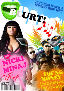
Our first decision for the magazine was the masthead. We chose the name blurt as it can be interpretated as a form of 'throwing up' the latest gossip, fashion and music. It can also be seen as away that the information in the magazine is so intersting/intreging, that it can no longer be contained in a persons mouth and has to be shared hence havingthe symbol of an open mouth. In addition to the symbol, we then decided that each issue would ha ve a different coloured mouth (using hue/saturation) and the first two letters ofthe title would be different colours too. This could then make it more of a collectors item having 'all the colours' of the magazine.
Our second decision was who we wouldhave fetured in the magazine. This came down to the rap group 'Young Money' and 'Niki Minaj' (who is also in the group). At the current time this task took place, thesevarious artist appeared to be the centre of attention within the media having just released new singles.
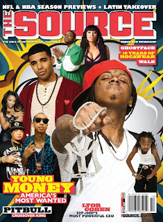
Here are a few images of magazines that the artist have also been featered in:
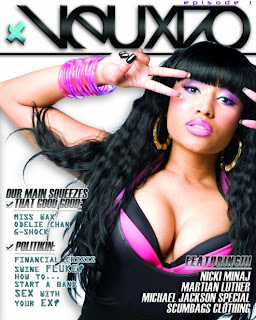
By having such well known artist on the front cover of our magazine, it would be an easier way of attracting our target audience and them being able to read the magazine.
The paricular picture of Young Money chosen, with one ofthe members using his hands to cover his mouth has a link to the 'mouth' symbol used. This could be because the hands covering the mouth represent gossip wanting to be shared but can no longer be contained or that he has almost given out too much information (leaked a secret) which adds mystery to the magazine making itmore appealing to the reader. As well as it being a interview with the group, we decided to use broken glass on top of the image creating an idea that the information that had been given in the interview is so much and so brilliant that not even glass can withstand it.
Having a large picutre of the artist Nicki Minaj may be the main focus to the magazine and cause my target market to be attracted to the magazine. The picture of her used is very seductive as she has slightly squinted eyes and her lips parted. This could also show a sence of pleasure by her facial expression and confident in her body language with her hands on the pockets of her jeans pulling them down a little to tease the viewer. The font used being a bold pink and large font may represent the artist personality and pehaps give a taster of the style of answers she may be giving in the magazine. We then chose to use the 'Barbie' heart in as the dot above the 'i' in her name as she is well known for the barbie image she portays in her style of music and her image. (She usually wears a large Barbie necklace but seeing that in this picture it is not present, the symbol we chose is a reminder to the audience and her potential fans).
The term 'iRap' was used because it may appear that the most 'must have' gadget is the iPod, so this can be used as a Pun.
A musical picture along with the musical notes in the background is a way of portaying to the reader that the music aspects of the magazine are the most important/ focused on. Above these images is a type of dripping blue paint, this was chosen as a symbol of 'spilling' also a form of gossip being spilt into the magazine.
Futhermore, my partener and I chose to use spray paint as a the background of the featured articals of the magazines. We feel that using such things would allow the reader to connect with the magazine on a more creative level (seeing as many of my target market may enjoy such things as spay painting/ graffiti in their spare time).
Finally, we decided that this magazine would be monthly, this is because the magazine would have a variety of pages (perhaps 100), which could keep the reader busy yet antisipating the next issue.
Wednesday, 24 March 2010
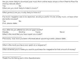
Questionnaire For Target Audience
Friday, 12 March 2010
Music Genre Class Task
Myself and my partener were given a task in wich we had to portray a pose/ stamce that could symbolise our music genre.
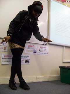
The genre we were given was rap, and as some of my accessories i.e. chain, hooded jacket etc were suitable at the time I chose to pose.
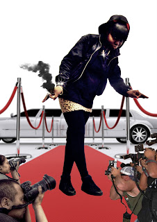
The first thing i wanted to do within my pose was to create symbols with my hands. This is done in a variety of rap artists as in most cases they are paying honour/respect to the group that they are involved in. As well as putting the hood of my jacket up over my head to show a mysterious side to the character, I also chose to show off my chains just as some artists like to show off the amount of money they have and what they are able to afford.
When down to the editing of the picture using photoshop, I emphasised my jewellery and and shiny parts to my clothes by addinga lense flare to it. I then cropped myself out of the classroom background to a plain one where I placed a red caprpet with a limoscene at the back again to emphasise the amount of money the character could afford and the fact that they are always invited to red carpet events and are only driven around in the most expensive vehicles.
The smoke coming from the hand of the character could display to the audience that they are simply 'To Hot To Handle'. In addition, the paparazzi on both sides of my character displays the importance of the character and their popularity as everyone wants a picture of the character reguardless of what angle they are taken from.
Wednesday, 10 March 2010
Friday, 26 February 2010
Reader Profile On A Gospel Magazine (Gospel Truth Magazine)
- Masthead- Large and eye catching
- Featured Artists
- Other Artists that are included in the magazine
- Barcode (to show price).
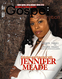
Although our genres of music are simular, I belive that this particular magazine is target at a more mature audince. I would then have to adjust my magazine cover by changing the style of font to a more lively a fun type, perhaps using more graphics, bright colours and catchy headline to draw the reader to my magazine.