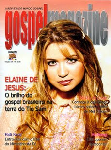
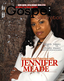
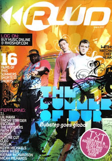

I then went on to look at other magazines that were not Gospel (in this case RWD a successful magazine in the UK- where my magazine will be distributed also), but either targeted a similar audience to mine or had the type of presentation/aspects that would like to use as my front cover. Many of these front covers consisted of bright colours, plenty of graphics and effects, large masthead, and could have more than one person/ celebrity on the front. These things are very important considering my magazine, so t can now give me a kick-start or guideline into what things could attract my target market.
Having all of this in mind, my next step was to look for graphics, decorations and fonts that would benefit my magazine in a way that makes it stand out from other Gospel magazines. I wanted to use 'Splats', spray paint and graffiti again connecting to my audience on a creative side i.e. hobbies and skills they enjoy using.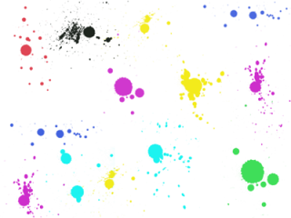



Here are just a few of the images I was able to find to my liking. As I had previous experience of using photoshop, I an advantage knowing how to change the colour of the images, size, add/subtract from the images and use them in a way to benefit my magazine.

No comments:
Post a Comment