Wednesday, 31 March 2010
Final Picture Chosen

Elements I Wanted To Include In My Front Cover
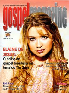
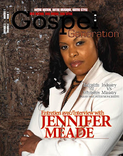
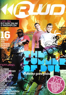

I then went on to look at other magazines that were not Gospel (in this case RWD a successful magazine in the UK- where my magazine will be distributed also), but either targeted a similar audience to mine or had the type of presentation/aspects that would like to use as my front cover. Many of these front covers consisted of bright colours, plenty of graphics and effects, large masthead, and could have more than one person/ celebrity on the front. These things are very important considering my magazine, so t can now give me a kick-start or guideline into what things could attract my target market.
Having all of this in mind, my next step was to look for graphics, decorations and fonts that would benefit my magazine in a way that makes it stand out from other Gospel magazines. I wanted to use 'Splats', spray paint and graffiti again connecting to my audience on a creative side i.e. hobbies and skills they enjoy using.

Here are just a few of the images I was able to find to my liking. As I had previous experience of using photoshop, I an advantage knowing how to change the colour of the images, size, add/subtract from the images and use them in a way to benefit my magazine.
Tuesday, 30 March 2010
Faith Child Album Launch
On December 4th, I attened an album launch held by a gospel artist 'Faith Child'. I realised that this was a great opportunity for me to put my photography skills to the test, understand camera angles and absorb a gospel atmosphere which would later be used to my advantage when producing my magazine. Below is presentation of a few of the picutres taken at the event. (There were over 500 picutres taken in total).
Test Shots Demonstrating The Understanding Of My Genre
From an eariler stage during my magazine construction, I chose to interview a gospel group by the name of 'Forever Christ'. Having the opportunity to meet the in person, I grasped the it and took various pitcures of the group so that I could use my photography skills and develop my understanding of how to direct the members into various poses, use mise-en-scene, camera angles (such as medium long shot etc.) in a way that I would be able to attract my targert audience. The picutres taken could also potentially be used as my front cover or on my contents page so I tried to make the pictures quite fun and exciting, having relaxed body language, smiles and casual clothes.
Friday, 26 March 2010
Simulation Task
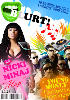
In addition to theresearch that hadto be gatheredcontribting to my magazine, myself and a partener took part in a simlation task wherewe had to produce a fron cover of a magazinefor our tager audience being 'Rude Boy'. This was for males aged 16-19 who are interested in genres such as hip-hop, R n B, rap, drumand base etc.
Our first decision for the magazine was the masthead. We chose the name blurt as it can be interpretated as a form of 'throwing up' the latest gossip, fashion and music. It can also be seen as away that the information in the magazine is so intersting/intreging, that it can no longer be contained in a persons mouth and has to be shared hence havingthe symbol of an open mouth. In addition to the symbol, we then decided that each issue would ha ve a different coloured mouth (using hue/saturation) and the first two letters ofthe title would be different colours too. This could then make it more of a collectors item having 'all the colours' of the magazine.
Our second decision was who we wouldhave fetured in the magazine. This came down to the rap group 'Young Money' and 'Niki Minaj' (who is also in the group). At the current time this task took place, thesevarious artist appeared to be the centre of attention within the media having just released new singles.
Here are a few images of magazines that the artist have also been featered in:
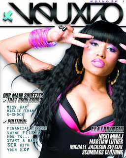
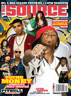
By having such well known artist on the front cover of our magazine, it would be an easier way of attracting our target audience and them being able to read the magazine.
The paricular picture of Young Money chosen, with one ofthe members using his hands to cover his mouth has a link to the 'mouth' symbol used. This could be because the hands covering the mouth represent gossip wanting to be shared but can no longer be contained or that he has almost given out too much information (leaked a secret) which adds mystery to the magazine making itmore appealing to the reader. As well as it being a interview with the group, we decided to use broken glass on top of the image creating an idea that the information that had been given in the interview is so much and so brilliant that not even glass can withstand it.
Having a large picutre of the artist Nicki Minaj may be the main focus to the magazine and cause my target market to be attracted to the magazine. The picture of her used is very seductive as she has slightly squinted eyes and her lips parted. This could also show a sence of pleasure by her facial expression and confident in her body language with her hands on the pockets of her jeans pulling them down a little to tease the viewer. The font used being a bold pink and large font may represent the artist personality and pehaps give a taster of the style of answers she may be giving in the magazine. We then chose to use the 'Barbie' heart in as the dot above the 'i' in her name as she is well known for the barbie image she portays in her style of music and her image. (She usually wears a large Barbie necklace but seeing that in this picture it is not present, the symbol we chose is a reminder to the audience and her potential fans).
The term 'iRap' was used because it may appear that the most 'must have' gadget is the iPod, so this can be used as a Pun.
A musical picture along with the musical notes in the background is a way of portaying to the reader that the music aspects of the magazine are the most important/ focused on. Above these images is a type of dripping blue paint, this was chosen as a symbol of 'spilling' also a form of gossip being spilt into the magazine.
Futhermore, my partener and I chose to use spray paint as a the background of the featured articals of the magazines. We feel that using such things would allow the reader to connect with the magazine on a more creative level (seeing as many of my target market may enjoy such things as spay painting/ graffiti in their spare time).
Finally, we decided that this magazine would be monthly, this is because the magazine would have a variety of pages (perhaps 100), which could keep the reader busy yet antisipating the next issue.
Wednesday, 24 March 2010
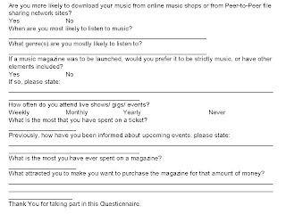
Questionnaire For Target Audience

Friday, 12 March 2010
Music Genre Class Task
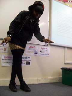
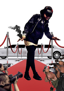
Myself and my partener were given a task in wich we had to portray a pose/ stamce that could symbolise our music genre.
The genre we were given was rap, and as some of my accessories i.e. chain, hooded jacket etc were suitable at the time I chose to pose.
The first thing i wanted to do within my pose was to create symbols with my hands. This is done in a variety of rap artists as in most cases they are paying honour/respect to the group that they are involved in. As well as putting the hood of my jacket up over my head to show a mysterious side to the character, I also chose to show off my chains just as some artists like to show off the amount of money they have and what they are able to afford.
When down to the editing of the picture using photoshop, I emphasised my jewellery and and shiny parts to my clothes by addinga lense flare to it. I then cropped myself out of the classroom background to a plain one where I placed a red caprpet with a limoscene at the back again to emphasise the amount of money the character could afford and the fact that they are always invited to red carpet events and are only driven around in the most expensive vehicles.
The smoke coming from the hand of the character could display to the audience that they are simply 'To Hot To Handle'. In addition, the paparazzi on both sides of my character displays the importance of the character and their popularity as everyone wants a picture of the character reguardless of what angle they are taken from.


