Thursday, 15 April 2010

Final Front Cover (Rough Draft)


After careful consideration and a lot of hours spent manipulating various things on photoshop, I went back to using the picture taken from the album launch and included the splats/sprays on the front cover.
For the masthead of the magazine, I chose to use a warning sign which was brightly coloured- Yellow used worldwide and recognised by many. That is also a goal for my magazine too (recognised worldwide). It can be a way of using subliminal messages to my audience saying 'Warning, Stop And Read This Magazine'. Then having the splats at the back of the warning sign, it give the impression of urgency being thrown onto the front cover as well as making it urgent for my target audience to read the magazine.
The barbed wire around the warning sign was used specifically as a way of representing Christianity remembering the fact that when Jesus was crucified, He wore a crown on thorns around His head. By having this, again I am able to connect to ,y target audience on an emotional level, which i think was successful as the iconography is an easy way of making my magazine distinct from others.

Sunday, 11 April 2010

Potential Front Covers


This was the first cover I wanted to used for my magazine.
It is incomplete as I realised during the making of this that it fails to attract my target audience, does not look like a conventional magazine and is not eye-catching.


However I wanted to continue to use the record element as it represents music and is an obvious symbol. I then wanted to have other aspects of my magazine i.e. the Bible, clothes, shoes and accessories bursting out of record (just as the graphic design) to show to the reader that as well as music being the most focused upon, there will be other sources of entertainment in the magazine to keep the reader occupied.


One of the main aspects of the magazine was the interview with Forever Christ, so then I decided to crop out one of the images I took of a member of the group and use it on the front cover which allows the reader to have an insight to what the members look like if that have not already seen them before. I also chose to use this particular picture because his body language is very comfortable/ approachable and he happens to be pointing in the same direction as the masthead. By having that it could almost create the illusion that he is a aware of the fact that he is on the front cover of the magazine and appreciates it. (It is very common for a person to point at something/someone whilst taking a picture as is shows respect and appreciation).
Lastly, I managed to continue to use the splat/spray feature on the front of the magazine underneath the record which is a theme that I think worked successfully.


Here is another attempt of a front cover.

I very much liked the record idea so I chose to use it again this time without having any decoration in the background, this was so that it would not clash with the picture of all the members of Forever Christ.
I didn’t think this would be a successful magazine front cover due to the fact that having three males along with blue font makes the magazine seem very masculine. By having this it limits my target market as well as making it ender bias. So I chose not to use this either but develop the idea of splats/sprays.

Trying Out A Masthead


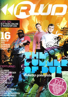
After being inspired by such magazines as RWD as well as using elements from other Gospel magazines, this was a masthead I managed to create as a sample.

I very much liked the 3D effect and wanted it to be carried throughout the magazine but realised that the colours used were not appealing (even though blue and pink represent male and female), I did not like the shades either. The colours are too pale and would make it very difficult to find graphics/pictures etc that would compliment this.

Wednesday, 7 April 2010

Researching Mastheads


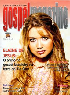
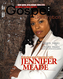
This is a selection of mastheads I gathered whilst doing reseach into Gospel magazines. After deciding on the name of my magazine, I then looked for inspirational texts and ways they can be portrayed to gain the intrests of my target audience. Other than the masthead of 'Gospel Link 360' which looked the most modern, I did not like any of the mastheads as they all seemed very blank using dull colours our decoration to make it stand out. These points could then help me to make my masthead look more interesting.

Saturday, 3 April 2010

Choosing A Name


Here is a mind map of various names that I could have used as the title of my magazine, my aim was to have something that was 'Punchy', rememberable and leaves a lasting impression.
Finally, I came up with a completely new idea and thought of the name 'Next Ting Gospel'. This name was chosen because it it portays youth as well as a Chrisitan atmosphere. The word 'Ting' is sang widely used in the younger generation's vocabulary and 'Next Ting' acts as a form of mystery, it can als show that what is within the magazine is not what was expected, beyind the readers imaginagion and something that cannot be categorized.

Wednesday, 31 March 2010

Final Picture Chosen


After going through various pictures, attempting and failing to make them work and appeal to my target market, I chose to go for more of a different approach than most gospel magazines and make the issue I am producing a 'Special Addition'.


In order to do this, I used a picture taken at the event I attended (Faith Childs Album Launch), this particular pictue was chosen as it captures the sheer joy of eerybody's faces as well as it being in mid-action. The angle of the picture tke allows the audience to feel as though they themselves are looking up towards the artists on the stage as if they were present within the crowd.

Elements I Wanted To Include In My Front Cover

After looking through a selection of front covers of Gospel magazines, I realised that the audience they were appealing to seemed much more mature than who am aiming at.


Many of the front covers were very subtle, with minimum decoration and very basic text. In order to make my front cover eye catching, I knew that I must have decoration i.e graphics and unique fonts with catchy titles. I also realised that as my magazine has a niche market, I would need to ensure that I have as many readers a possible and from my knowledge alongside some research done, the idea of a Gospel magazine like the one I wish to create is something outside of the box as well as there being a gap in the market for this product.


I then went on to look at other magazines that were not Gospel (in this case RWD a successful magazine in the UK- where my magazine will be distributed also), but either targeted a similar audience to mine or had the type of presentation/aspects that would like to use as my front cover. Many of these front covers consisted of bright colours, plenty of graphics and effects, large masthead, and could have more than one person/ celebrity on the front. These things are very important considering my magazine, so t can now give me a kick-start or guideline into what things could attract my target market.


Having all of this in mind, my next step was to look for graphics, decorations and fonts that would benefit my magazine in a way that makes it stand out from other Gospel magazines. I wanted to use 'Splats', spray paint and graffiti again connecting to my audience on a creative side i.e. hobbies and skills they enjoy using.


Here are just a few of the images I was able to find to my liking. As I had previous experience of using photoshop, I an advantage knowing how to change the colour of the images, size, add/subtract from the images and use them in a way to benefit my magazine.